
Date:after 1765


In my years of looking at Japanese woodblock prints, known as Ukiyo-e, no artist from that rich tradition has impressed me as much as Suzuki Harunobu. I often pour over Ukiyo-e prints with a mercenary eye, looking for colors and forms that appeal to my tastes. My privileging of Harunobu is above all a reflection of that taste, and my defense follows it.
Harunobu (1724-70) is not well known in the West, but he was an innovator, introducing the first full color prints to the Japanese art form. Up to that point, 3-color printing often reduced Ukiyo-e to a simpler activity of the eye. Perhaps his particular power comes from contact with this freshly broken limitation, because here color is the thing to see.
His line work is spare and unobtrusive at best, and remarkably less expressive than draftsman before or after in the tradition. In many ways his drawing feels like an appendage, a loose receptacle, an unobtrusive guidepost for color. One reason that he gets short shrift in the West could be that his prints don’t function well as graphic images. A stronger line has always been better suited for commercial reproduction, and the delicate, zephyr-like Harunobu produced no Great Wave. However, by comparison with Harunobu, the power of color seems lost on subsequent, more graphically inclined Ukiyo-e artists.
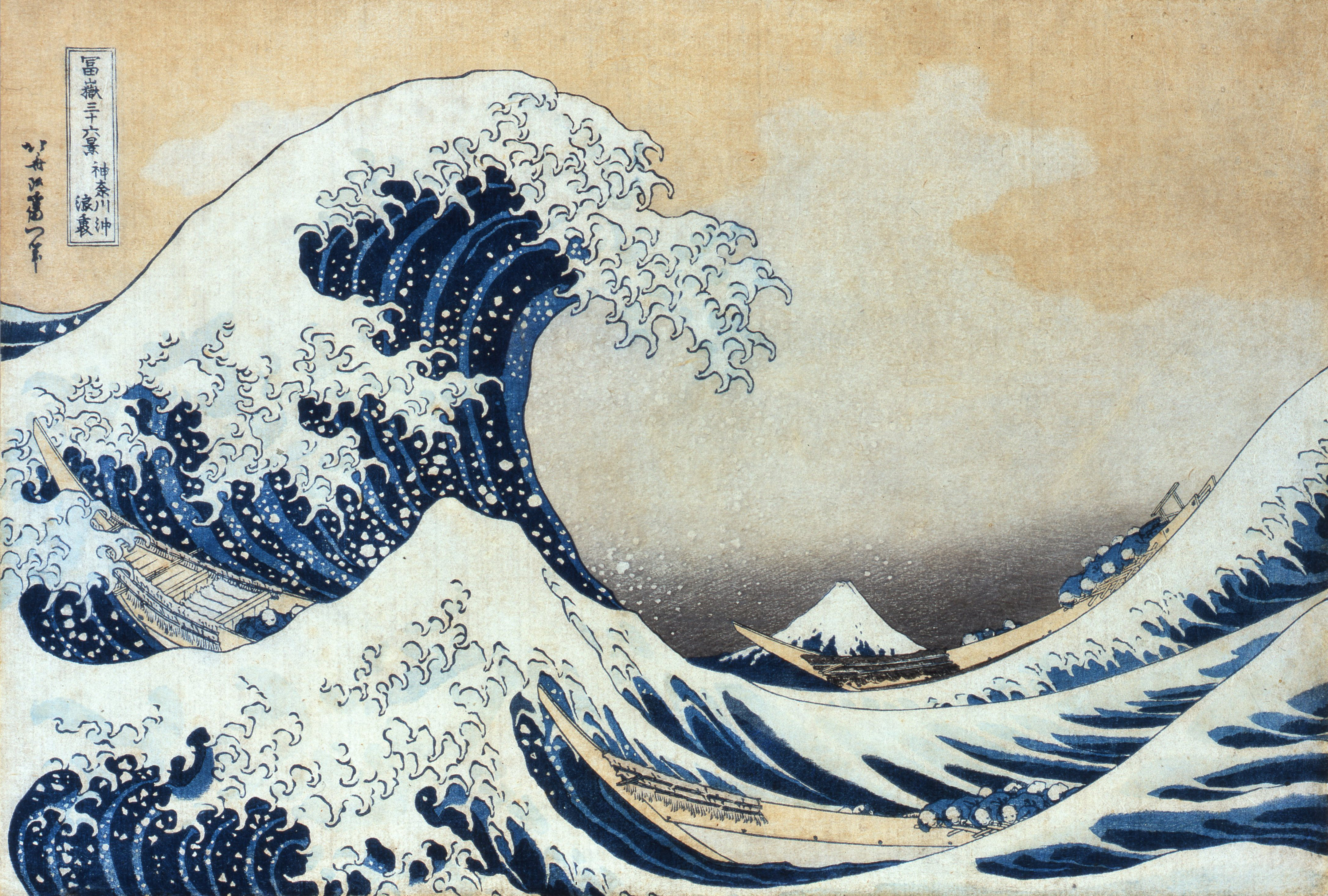
As Ukiyo-e developed, its practitioners lent themselves more and more to linearity – a maximum of communication and an expressive line. But to my eye, the delicate balance of line and color in Harunobu makes for such a remarkable tension that these later heroes fail to measure up. Hokusai appears overdone in comparison – too flat, compositional and posterized. Hiroshige comes off as a bore – his disposition to balance is noble but too sedate, especially considering his concessions to a grounded (rather than isometric) perspective.
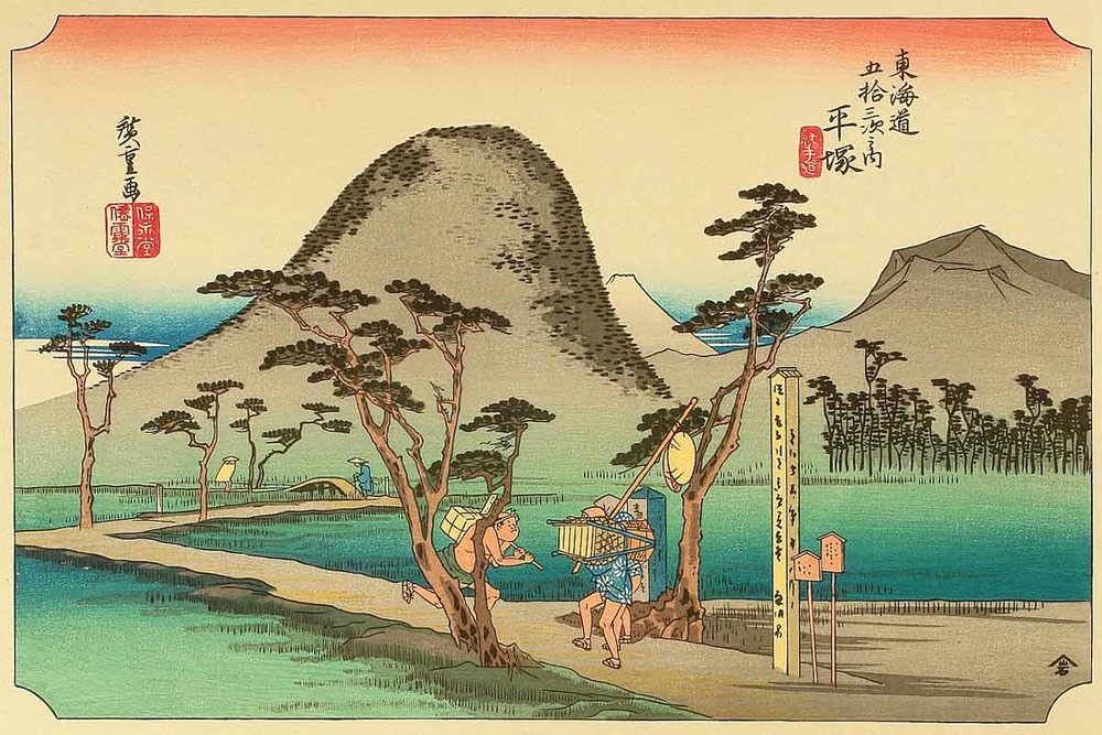
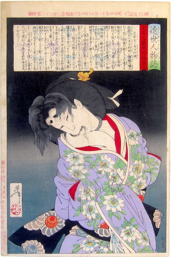
Kuniyoshi and Yoshitoshi (and the whole later Utigawa school by extension) appear to totally abolish color’s virtue in favor of a mannerist carnival of form, which is typical of the late period in any artistic tradition. These later artists are all far more famous in the West. They have an element of dynamism (or in the case of Hiroshige, the picturesque) that is easier to love. The whipping curves from Hokusai to Yoshitoshi and the fine balance of Hiroshige (I and II), is in keeping with the West’s bipolar taste for Japanese culture: sensational and intense on the one hand and tranquil calm on the other.

Harunobu occupies a golden mean in that regard, a fruitful transition in the history of his art form that bears similarity to Piero Della Francesca’s place in European painting 150 years earlier. He is late enough that he has consolidated the medium’s “primitive” origins, but not so late that he has accelerated it in pursuit of novelty.

Date:1765 ca.
Ukiyo-e in general is praised for its graphic sense of line and color, but the degrees of the graphic are rarely held to account. Color is omnipresent, but a strong black outline (the line of the artist, the object, the form) is always there to keep it in check. This is in large part because, mechanically, color has always been the accidental element in a print. It is applied fresh for each pull, while line remains a permanent touch of the artist’s hand. While Yoshitoshi‘s prints have no shortage of dazzling color, line leads them definitively. Color is an attribute, it is applied to objects. It is filled in unto their whipping curves. Similarly, Hokusai’s wave made of stylized line, is defined by intensity of pattern and repetition more than the color blue. The priority in the image is given to the object defined by the artist to which color adds power as a final cue, rather than as its guiding purpose, its loci.
For Harunobu, it is everywhere the opposite. Color hovers ahead of every action, even if that color is just the bland sheet of paper it is printed on. Line is there, but it acts as a bouey to release color, to set it free.

It is not only an unobtrusive line that releases color, but arrangement, and Harunobu sets himself apart there as well. His tendency was to work in registers of color, large unimpeded blocks that transition to others vertically and without recession. This allows color to impose, to push and pull, destabilizing the space of his pictures that gives them the quality of floating. Isometric perspective is not so much evoked as teased. Perspective only applies negatively. It is meaningfully broken toward the goal of color.
This is in keeping with the philosophy of Ukiyo-e, a word which is most often translated from Japanese as “the floating world.” The Japanese woodblock print was conceived under an ethos similar to Haiku poems – as a means of expressing the transience of all life. This ethos was the context by which the Japanese justified radical depictions of everyday life, with far more directness than any culture of art before or since. The sparsely populated color fields of Harunobu are everywhere a manifestation of this goal. If these open fields of color communicate a meaning, it is essential emptiness. They act as couriers of the absence that lies pregnant within the picture. Line is only a mirage in life. What better thing than color then, that most mutable element, to conjure a mutable world.

Date:1766

Date:1767-68
